this is a link to the homepage

To Know, Worship and Love - Marketing Collateral

Digital Designer - 2022 - 2025

Project Involvement

Although my primary responsibilities involved creating digital assets, illustrations, and animations, I also played a key role in elevating the KWL brand through design and motion graphics.

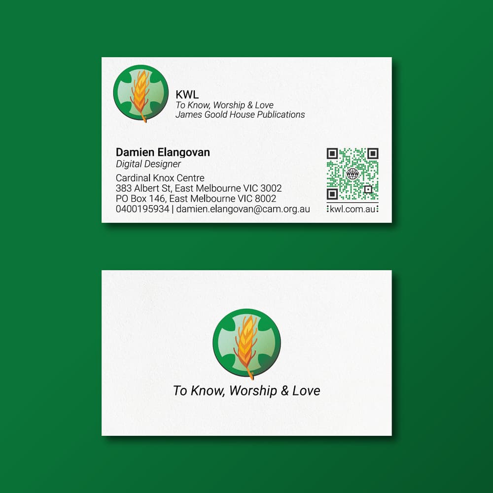
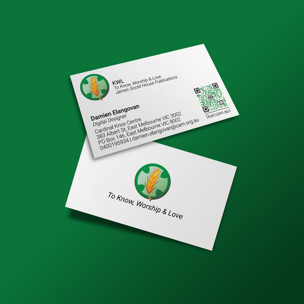
I designed staff business cards, refining layout, typography, and visual identity in line with KWL’s brand guidelines, and managed the process through to final print.

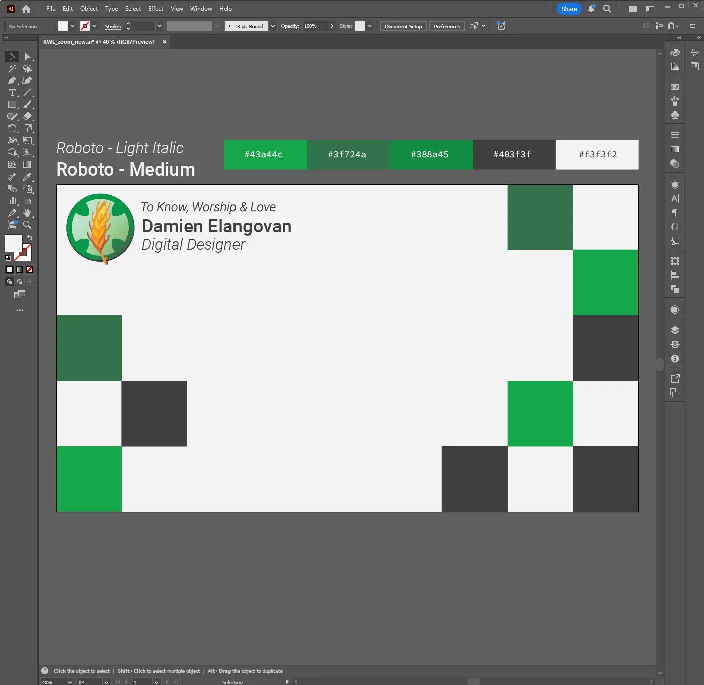
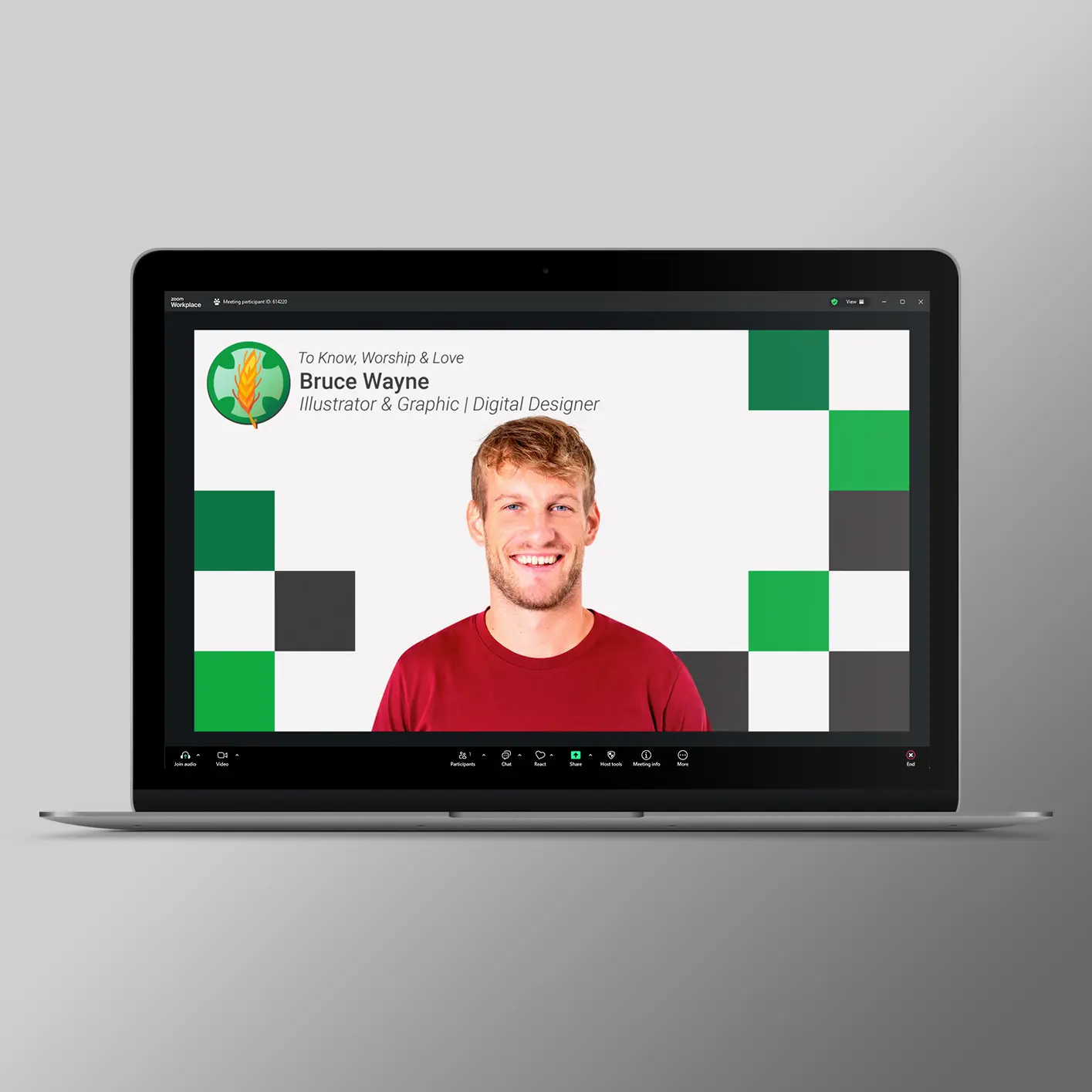
I also created video-conferencing backgrounds to provide a unified and professional team presence during company meetings.

In addition, I produced a suite of motion-based brand elements, including logo animations and promotional video graphics, further strengthening KWL’s visual identity across both print and digital touchpoints.

Apps and Skills:

Adobe Creative Suite (Audition, Photoshop, Illustrator, After Effects (with Overlord)), Lottie/Bodymovin, HTML, CSS, JavaScript (Sublime/ VS Code), Jira, Bitbucket, Slack, Zoom, Microsoft Office Suite, UI/UX, Storyboarding, Animation, Photography, Educational Design.

Hardware:

Apple MacBook, Blue Snowball Recording Microphone.

Disclaimer – All works displayed in this section of my portfolio was created for and is owned by To Know, Worship and Love.

Logo Animations

For our promotional video sent to schools to highlight KWL’s new learning materials, I was responsible for designing and animating the intro and outro logo sequences.

I recorded the bell-ringing audio from St Patrick’s Cathedral bell tower, sourced and edited the supporting footage sourced from our Communications team, and re-worked the KWL logo for animation (see image on right). I then brought the logo to life in After Effects through custom keyframing, motion design, and timing it precisely to the bell ringing audio, which was edited in Adobe Audition.

Below are three versions of the logo animation, with Intro and Outro 3 being selected by the team.

This is a portfolio piece.

Intro and Outro 1

The rolling text animation using the three letters of “KWL” is designed to represent the Catholic Church’s belief in a triune God, the Trinity.

This movement, paired with the coordinated motion of the left and right logo elements and accompanying text, also echoes the gesture of the Sign of the Cross. Together, these animated components create a visual expression of core Catholic symbolism while reinforcing the identity of the KWL brand.

Intro and Outro 2

The concept behind this animation was to symbolise Christ’s tomb opening, represented through the movement of the circular KWL logo. The logo’s reveal echoes that moment of emergence and light.

I added a subtle lightning effect to enhance the sense of energy and awe, giving the rolling text animation a more dynamic and almost “magical” feel.

Intro and Outro 3

This version was ultimately selected by the team. It uses the same core animation as the earlier concept but removes the lightning effect. The team felt that the simplified motion, without the additional visual elements, created a cleaner, more focused presentation of the logo animation.

Business Card Design

I led the design and production of staff business cards, refining layout, typography, and visual hierarchy to create a clean and cohesive identity piece that aligned seamlessly with KWL’s brand guidelines.

Working closely with the internal team, I explored multiple design directions before developing a final layout that balanced brand expression with clarity and practicality. I managed the entire process end-to-end, concept development, design refinement, proofing, and preparation of print-ready files, ensuring accuracy in colour, type, and layout. The final cards provided staff with a professional, consistent touchpoint that strengthened the organisation’s broader visual identity.

This is a portfolio piece.

Conferencing Backgrounds

I designed a collection of branded video-conferencing backgrounds to help create a cohesive and professional on-screen presence for the entire team. Working within the company’s visual identity, I explored layout, colour, and typography treatments that would remain clear and effective across a variety of meeting platforms.

Backgrounds were crafted to balance branding with usability, ensuring key elements were visible without distracting from the presenter. These assets became part of the organisation’s standard toolkit, providing staff with a consistent and polished look for both internal collaboration and external client meetings.

This is a portfolio piece.

Thank you! Use the buttons below to head back to the main menu or check out my other works.